Accessible design for better browsing
March 12th, 2026
March 12th, 2026
Words Tam Jankowska
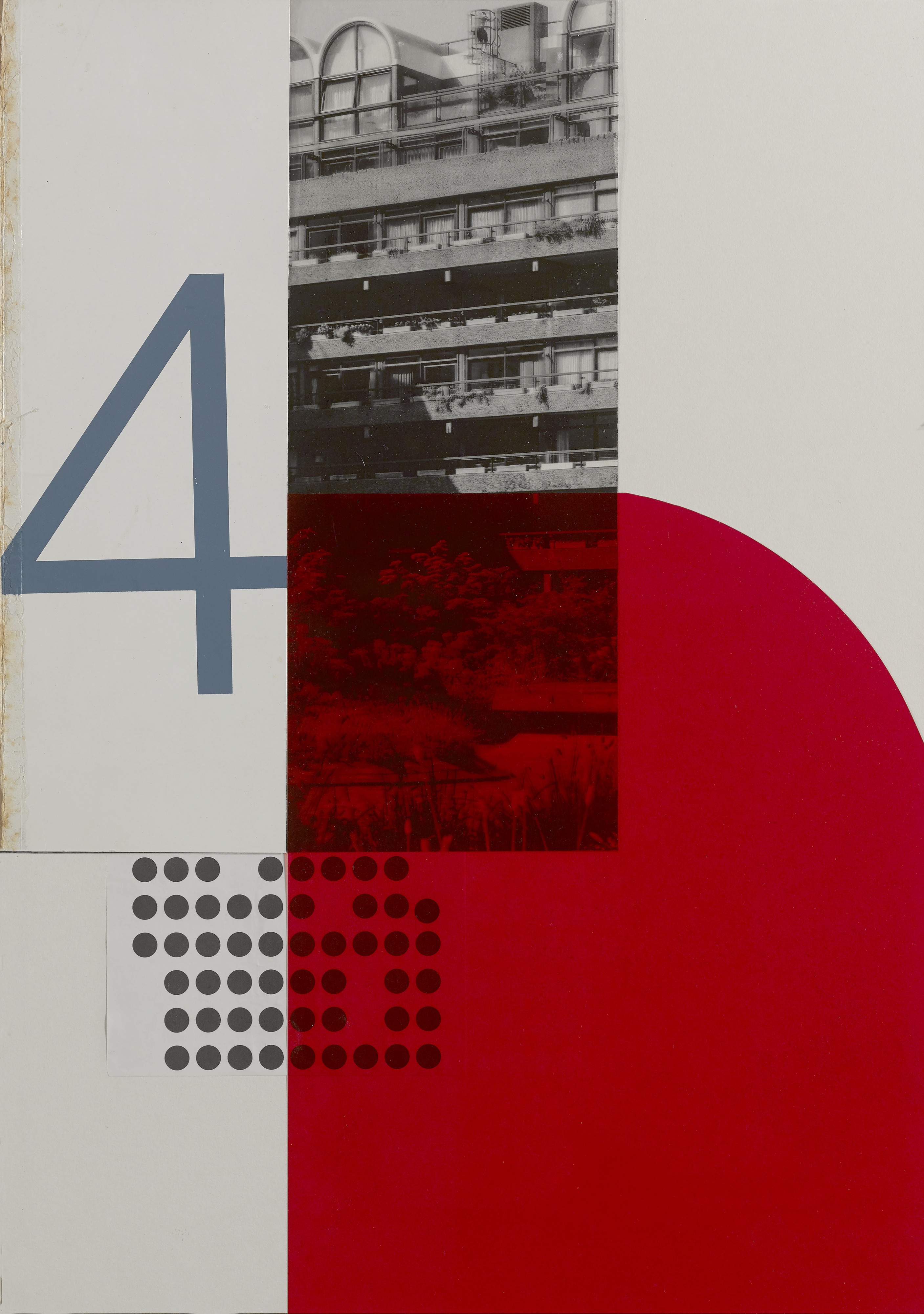
Collage Hannah Downton
Here at The Modern House and Inigo, we’re inherently interested in beautifully designed homes. We are also interested in how you, our audience, view those homes for the very first time – namely, through our websites.
They may not look like it, but the TMH and Inigo websites you see today are completely different to those of a year ago. Our in-house development team inherited two WordPress websites which had been maintained by an external company, and it was clear they needed to go. That gave us an opportunity to start from scratch. Both websites have been entirely rebuilt using Next.js and React with Sanity as our CMS (Content Management System). Once we had the websites in our control, we could really start to think about how to make them better.
At the forefront of our minds, before adding any flashy new features, was ensuring our websites were accessible to as many people as possible. We have high standards, so we are already at the recommended level of accessibility and are working towards the Web Content Accessibility Guidelines (WCAG) 2.2 AAA – the highest level of website accessibility in the UK. Sometimes, when people hear the word “accessibility”, they might assume it only applies to a small group of people, but actually, accessible design makes the user experience easier for all. Pages feel more coherent, easier to read, and less cluttered – and simple actions, such as using the arrow keys to browse the image gallery of one of our listings, can really make all the difference.
We came across axe DevTools, a browser tool that scanned our websites using WCAG 2.2 AAA criteria, and highlighted problems that needed fixing. However, we can’t solely rely on automated tooling to flag potential issues. As useful as these tools are, they cannot identify all accessibility concerns. At best, they can identify around half of the issues that exist.
In addition to running the automated checks, we also manually combed through each page. For users who rely on keyboard navigation, it’s very important that should they open up a modal (a little pop-up window), their focus is “trapped” within that window. This means that when they are tabbing through the page content, the focus remains on what they can view on the screen at that time, rather than being focused on some hidden element behind the modal. Using only the keyboard, we navigated through both websites, making note of areas that needed to be improved.
Some users use screen-reading assistive technology, so we enabled Mac’s own VoiceOver screen-reading software and navigated through each website, making note of what needed to be changed. Other users need to use 200% zoom or greater to be able to read text. Part of the WCAG criteria is about “reflow” - does the text still fit on the screen without the user needing to scroll horizontally? This is something else we tested. We went through every page of both sites and created 48 tickets (essentially a task or technical support query), each outlining an individual issue that needed to be corrected.
Over several weeks, we gave lots of components accessible names. This is a name for an element (such as a button or an input field) that describes to assistive technology what its purpose is. For example, form fields need accessible names (like labels) that a screen-reader can read out to the user, so they understand how they need to interact with it. A button might have an accessible name of "submit" so the user understands what will happen when they press it. An example of this from the TMH website is the search button. Previously, this didn't have an accessible name, so assistive technologies would not be able to indicate to the user what the button was for. It would simply show as an anonymous button. Now, a screen-reader would be able to identify it as a search button.
We also increased touch targets. A touch target is something you might click on, like a button or link. It needs to be large enough so that users who might struggle with fine motor skills can still interact with it. On the TMH website, when you click on the search, it shows a search field with an “x” to the right-hand side which allows you to close the search. Before, the touch target for this was very small, making it harder to press. We have now increased its size to make it easier to press.
We have also made sure that both websites can be navigated by keyboard and that the HTML is semantic (meaning that the HTML elements correctly describe their content, such as headings, lists, and paragraphs). Finally, we ran the tool again and it uncovered no issues on either website, showing that we were compliant with WCAG 2.2 AAA. Writing frontend code in an accessible way is essential, and this exercise has helped us to keep that in mind when we are writing new features and refactoring old ones.
The wider team has also been considering how to create content in a way that is accessible by default. We recently had some feedback on our Drawer of Things newsletter stating that the white text against the blue background was difficult to read. We had a conversation internally about how we could fix this. We considered building out a reader version on our website and including a link in the newsletter email. Ultimately, we decided the newsletter should be accessible in its default format and updated the design to reflect this. This is the approach recommended by the RNIB (Royal National Institute of Blind People).
We’ll continue to regularly review our websites and other content, ensuring we deliver high-quality features that never compromise on accessibility or usability. We welcome any feedback from anyone who has suggestions for accessibility improvements we can make. Please email us at tech@themodernhouse.com — we’d be delighted to consider your ideas.
This series will be accompanied by six original artworks created by Hannah Downton. Hannah is a Prime Buyer Specialist and collage and graphic artist; @hannah_downton_design
RELATED ON THE MODERN HOUSE