Add and subtract: a carefully calculated apartment by architect Carl Trenfield
September 30th, 2025
September 30th, 2025
Words Kate Jacobs
Photography Rachel Ferriman
The owners had worked closely with Carl on a previous project, Dartmouth Row in Blackheath, and knew they wanted him to steer the comprehensive reworking of this home, set in the peaceful enclave of Barons Court, on the cusp of central London. Back then, the apartment itself was unremarkable; Victorian bones with some interesting 1930s additions, such as the sculptural art deco fireplaces. “Qualitatively, there was very little of note beyond the 1930s, with decades of accretions such as exposed or crudely boxed-in services moving the host building away from what it was, and what it could be,” recalls Carl. Both client and architect were committed to the process and took their time over the renovations, focussing on quality and intent.
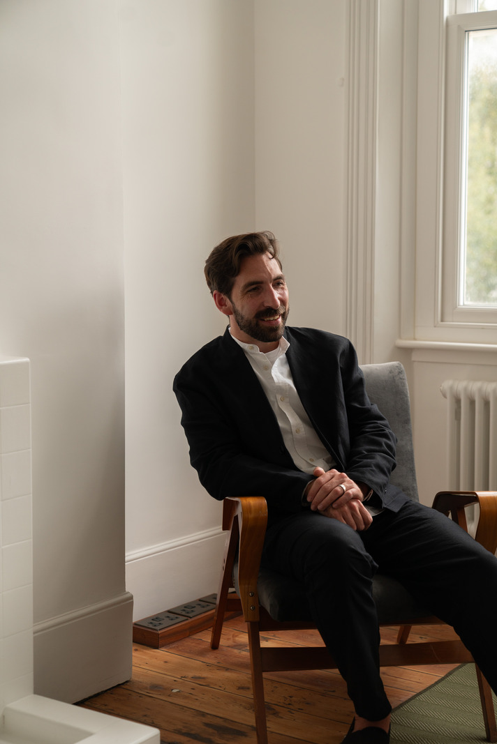
Carl Trenfield: “The client grew up within a Gujarati family, keen on high craft and surrounded by visual warmth, informing our shared creative approach to the expansive works to Dartmouth Row. There, we assembled a deliberately small and talented team, led by myself, offering the client a singular point of contact. Barons Court Road offered an opportunity to bring the team back together to see if we could do something inherently special, but in a completely different setting.
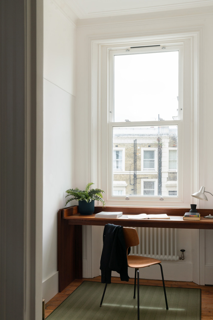
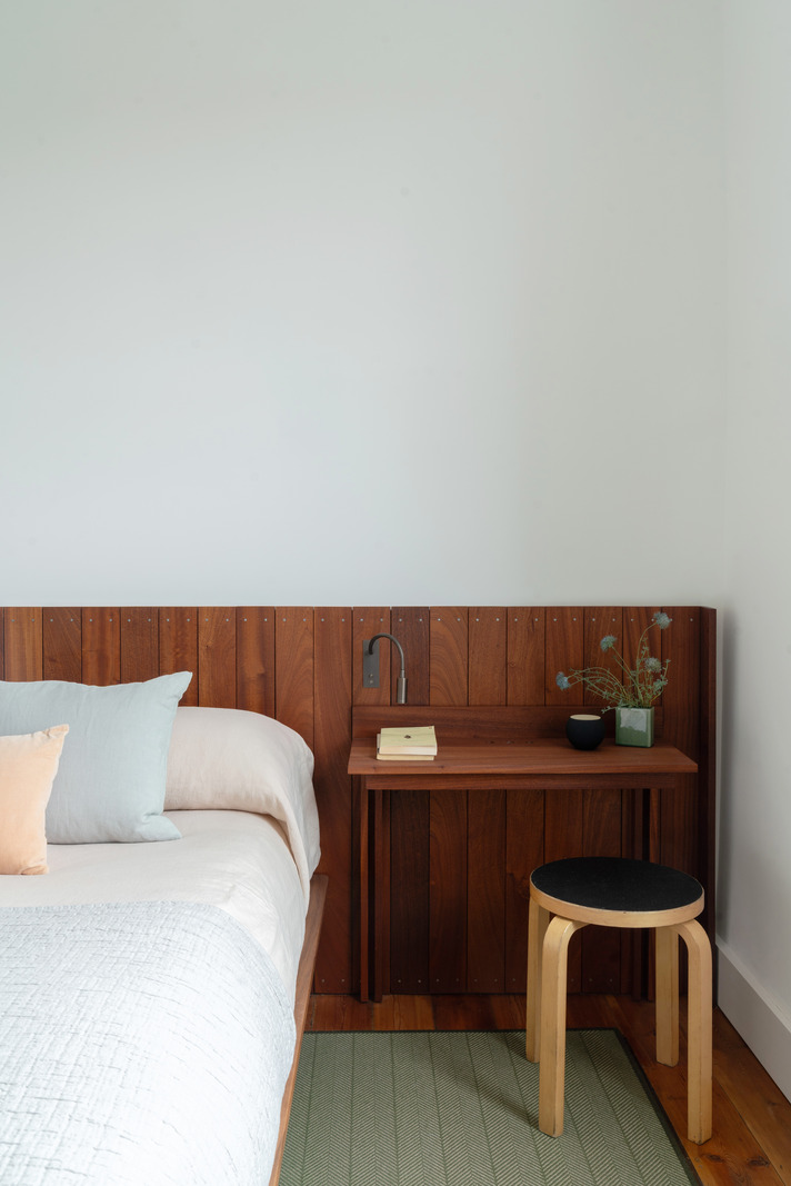
"The brief for this project was initially pragmatic, rather than expansive; the client asked me to give the maisonette some character and presence. This client doesn’t just say ‘off you go’. It’s a well-trodden trope that good architecture needs a good client, but that has been the case here where we often iterate to the good; an approach heavily informed by the client’s tech sector background. Over several years, the design evolved through close observation, incremental decisions, and a growing sense of place – where craft, making and utility have found an equal footing. In terms of utility, we created a second, and now primary bathroom on the upper floor, requiring precise coordination, and a study with a purpose-built desk for our new modes of living. Much was about improving the utility for modern life.
“Beyond that, this project explores a literal expression of subtraction – stripping away the thoughtless and clumsy additions of prior decades. If you were to boil the project down, it’s a careful series of subtractions that reveal the host building, to bring into focus its qualities, rather than just seeking mere modernisation. My particular interest in the subtraction, though, was in seeing what we actually found.
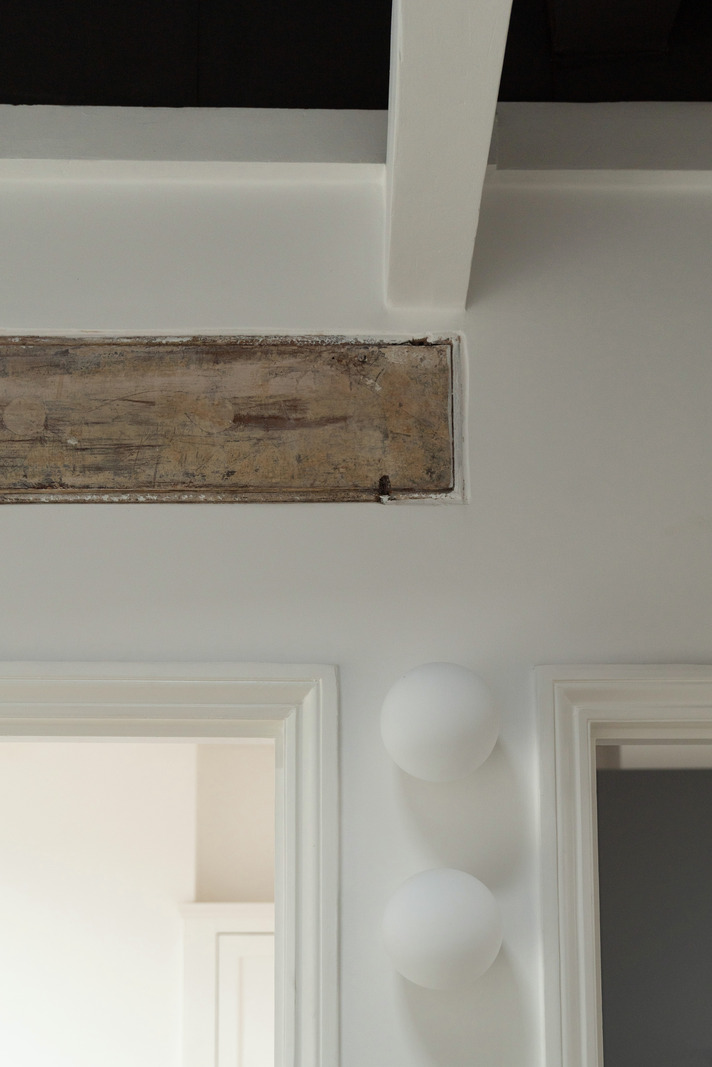
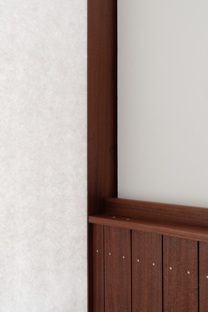
"Upstairs, having opened up the top of the staircase into the roof space above, we left the ceiling joist exposed to create a memory-marker, retaining a datum of where the ceiling once was. In the bedrooms, even though the wall has been rebuilt, we left the now obsolete doorframes and inserted timber blocks in lieu of keeps, so you get this echo of what was once there. The art deco fireplaces are another important part of the story. We knocked them back with a white slurry, so that they now recede to become a new past, whilst still crucially maintaining a layer of character.
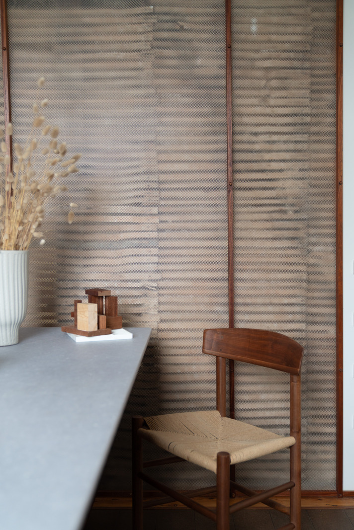
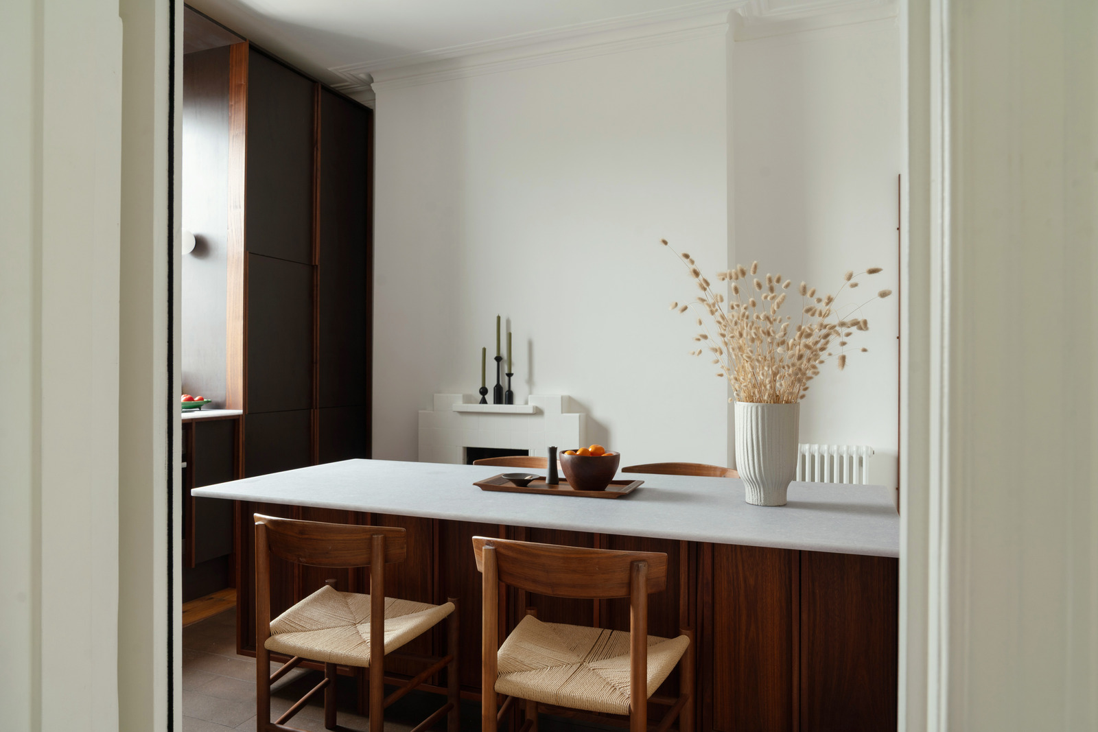
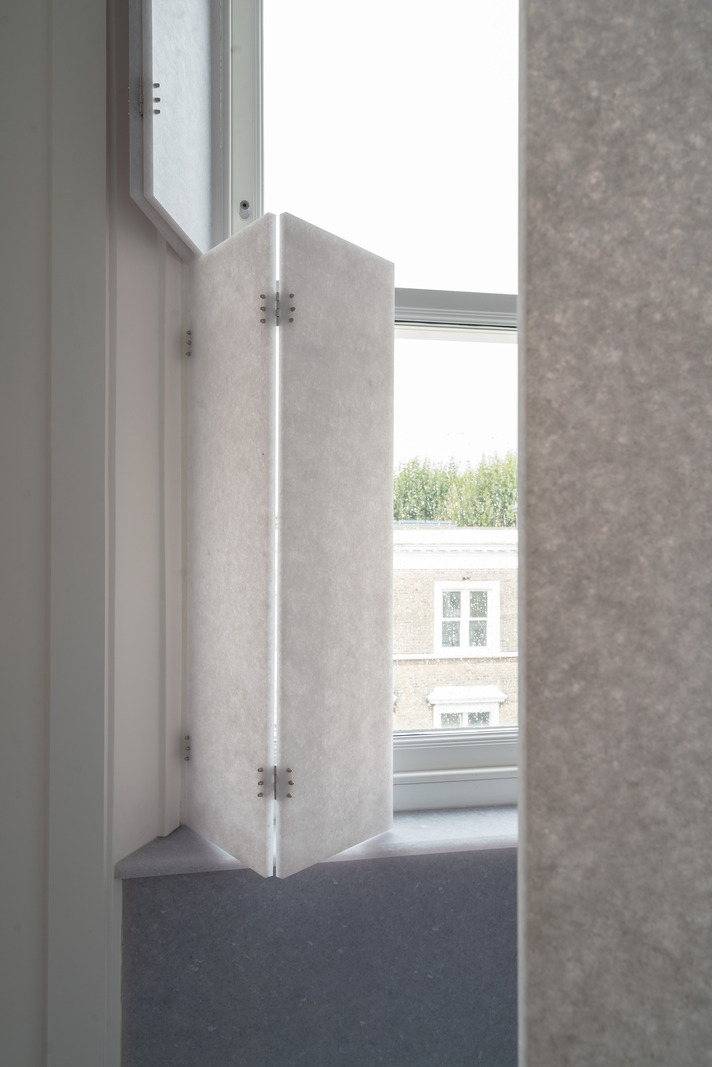
“On the lower floor, rather than create an opening between the kitchen and living room, we explored the play of light by removing the plaster layer to expose the original laths, before wrapping each side in sapele-framed panels of prismatic polycarbonate, with a more transparent version in the kitchen. It’s a showcasing moment for the space. We’ve then used a translucent plastic as a work surface, and elsewhere, a shower screen and as window shutters, all recycled from Smile Plastics. I was stunned by the plastic, it has this feel of Japanese rice paper and different thicknesses affect the light in different ways.
"In the kitchen, plywood, stained darkest brown, is layered with FSC sapele timber, with a custom-made central table-island that straddles contemporary and traditional modes of making. I think we all yearn to be around timber. People say architects are trying to excavate to something in their childhood and for me, that’s the protective cocoon of my dad’s office – a former 1920s funeral parlour – with its timber walls and considered light fittings.
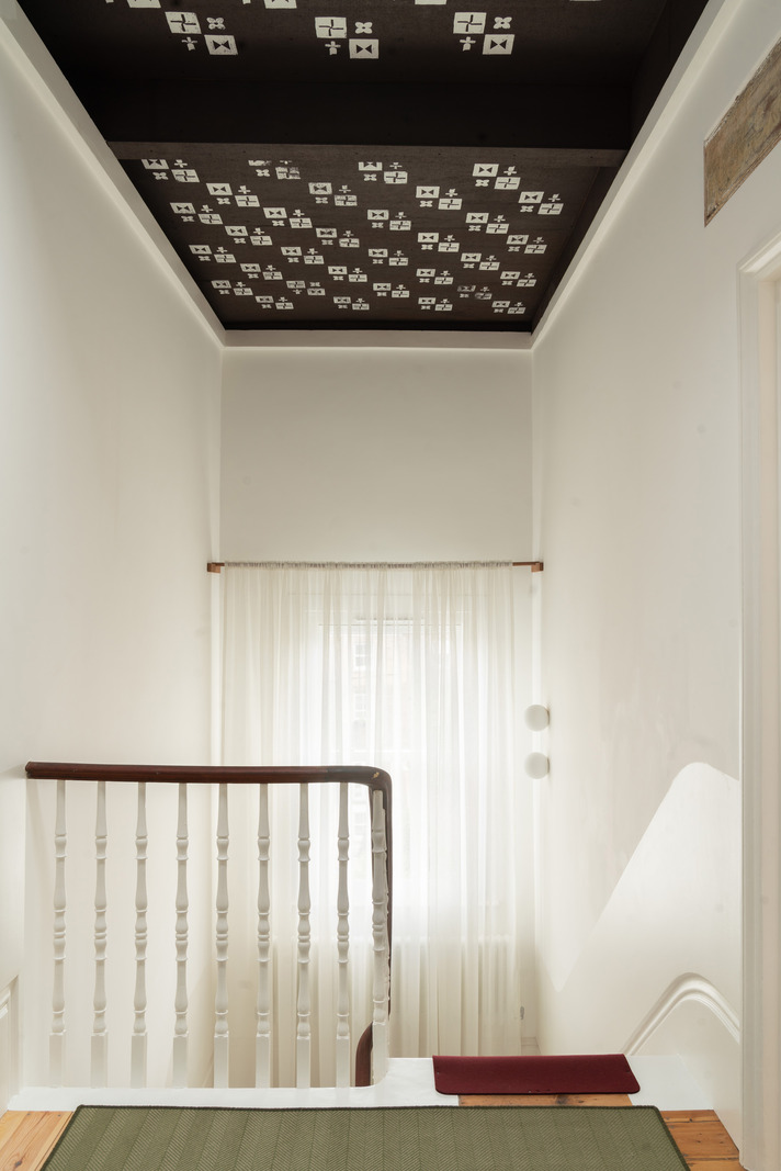
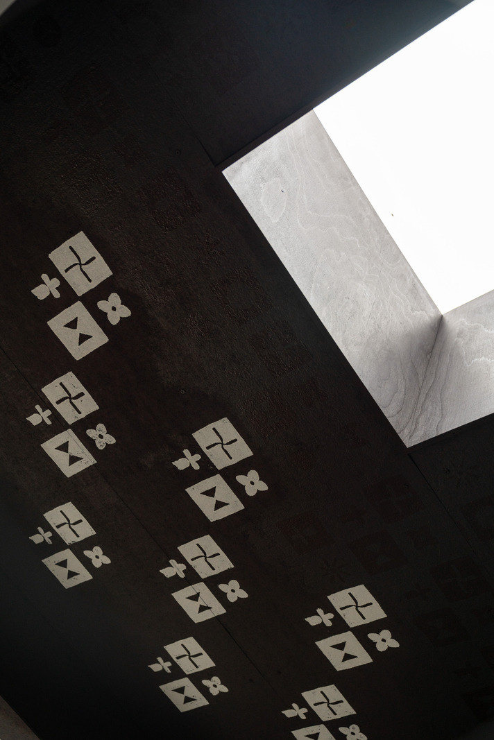
“At the top of the house, the newly-raised ceiling ‘felt’ flat and needed additional character, so I decided to use stamps, made from laser-cut packing-foam blocks. We designed and 3D-printed a cradle to hold the stamps on the end of a painter’s pole. For the symbols on the stamps, I looked for local inspiration. This part of west London has some interesting links to the Pre-Raphaelites; Edward Burne-Jones and William Morris both lived near here, and there are the incredible Arts and Crafts artists' studios on Talgarth Road. The pioneering aviation engineer, Geoffrey de Havilland, lived just next door. With this in mind, I created stylised flowers and pinwheels – a fusion of a petal and a propeller. I wanted it to look a little irregular and imperfect. It was a way to explore this volume and give it more presence.
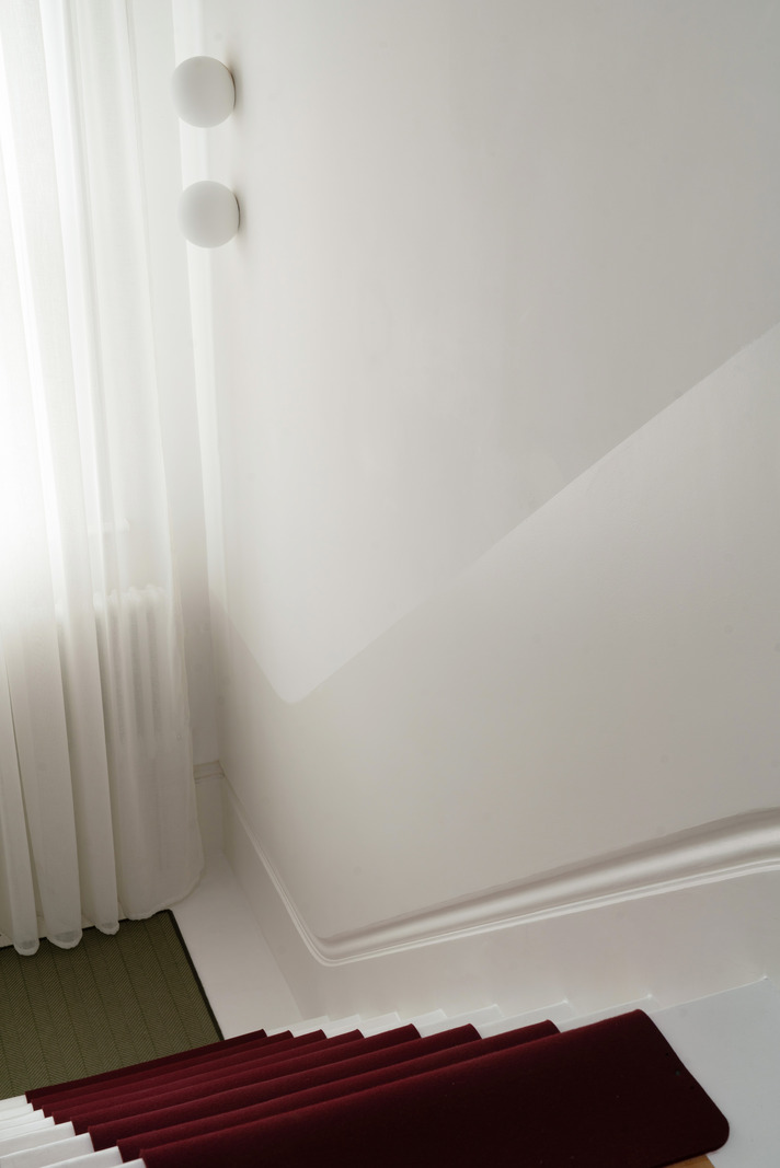
“Rather than a conventional stair runner, we used die-cut felt stair pads, made to our design and cut directly from our digital drawing. A deep red was chosen for a sense of warmth, but the client became concerned about the red jarring with the greens that run through the space. So, I threaded the green through the stair area by adding a simple green dot to each riser – achieved by a felt pad dunked in paint fixed to the end of a hammer. Alongside the screens covering the lath wall, I created little plaster ‘pargets’, in abstracted forms that are a familial to the painted symbols and a contemporary nod to the area’s artistic history.
“The way I work is very much ‘on site’, getting back to the idea of the hands-on chief builder; which is the etymological origin of the word architect. There’s that ease of recalibrating if (when) you get something wrong and I’m often happiest in a mode of making whilst thinking. We’ve lifted this space through craft and character, giving it a greater sense of warmth and presence. Now it’s a starting point for other people to come in and set their layers on top of that.”
RELATED ON THE MODERN HOUSE